The Map-Maker's Daughter: Navigating the complex world of Product through mapping
Simple, actionable mapping techniques for Product Managers tackling complexity
I inherited my love of maps from my dad. As a Geomatician, he spent his career surveying the Earth and creating maps, and worked on a precursor to GPS.
Maps aren’t reality, they are only a representation of it, but no one would deny that they are useful. They help us to find our way in the world, communicating a huge amount of information that would otherwise be incredibly hard to make sense of. They enhance our understanding of the information around us. I can see a hill out of my window, but I don’t know how far away it is or how high it is – a map can tell me. Maps can also reveal hidden information – satellite mapping has helped to uncover structures like ancient settlements or underground reservoirs, which otherwise would have been hard or even impossible to find.
At its core, mapping is the process of visually representing information to reveal relationships, patterns, and structures. As I ventured into product management, I realised that maps weren’t just for navigating roads and landscapes - they were just as valuable for navigating complexity in organisations. I found myself instinctively drawing out my thoughts, sketching relationships between ideas, and mapping out strategies, customer journeys, and problem spaces. Whether formal or informal, structured or messy, these ‘maps’ became my way of making sense of uncertainty and bringing clarity to my work.
What are maps useful for?
I find mapping most useful for distilling and clarifying complexity, and exposing hidden patterns and assumptions. I use them as part of a research process into a new industry, market, organisation or other problem space – to pull together and process information from across sources to increase my own understanding and help shape my thinking.
Often they start off just for myself, however, they are also incredibly useful for communication and alignment. People process information in different ways – for some, a quick conversation or a few bullet points might work, but for me, drawing things out makes ideas tangible. I’ve found it sparks better conversations—especially in diverse and cross-functional teams.
Making a map: it’s about the journey
When it comes to creating maps, I don’t follow a strict framework or definition. For me a map is just a visual representation of information, rather than a list of instructions, or a paragraph of text for example.
There are a whole host of established ‘maps’ in Product Management, from user story mapping to customer journey mapping, to Wardley mapping, but I wanted to share some of my thoughts on some less formal, more free-form mapping which I find incredibly useful. It also doesn’t need to be beautifully designed, or particularly tidy. Most of my maps are just boxes and arrows.
For me, the process of mapping is more important than the final map I end up with. It’s about distilling complex ideas, spotting connections, and revealing hidden assumptions—and that’s usually where I uncover the most insights.
My favourite types of maps for Product Management
Mapping markets
As a consultant, I often find myself working in an unfamiliar sector and I need to get up to speed quickly. There are lots of established frameworks for mapping markets, but they sometimes feel a bit too rigid when I’m first getting started. I love using something simple like a 2D matrix - maybe impact vs effort or price vs performance - but often I don’t even know what axes make sense yet! This fantastic article by Steve Blank explains a simple technique to build a map of any industry – I've used variations of this many times and the article includes some great prompts and questions.
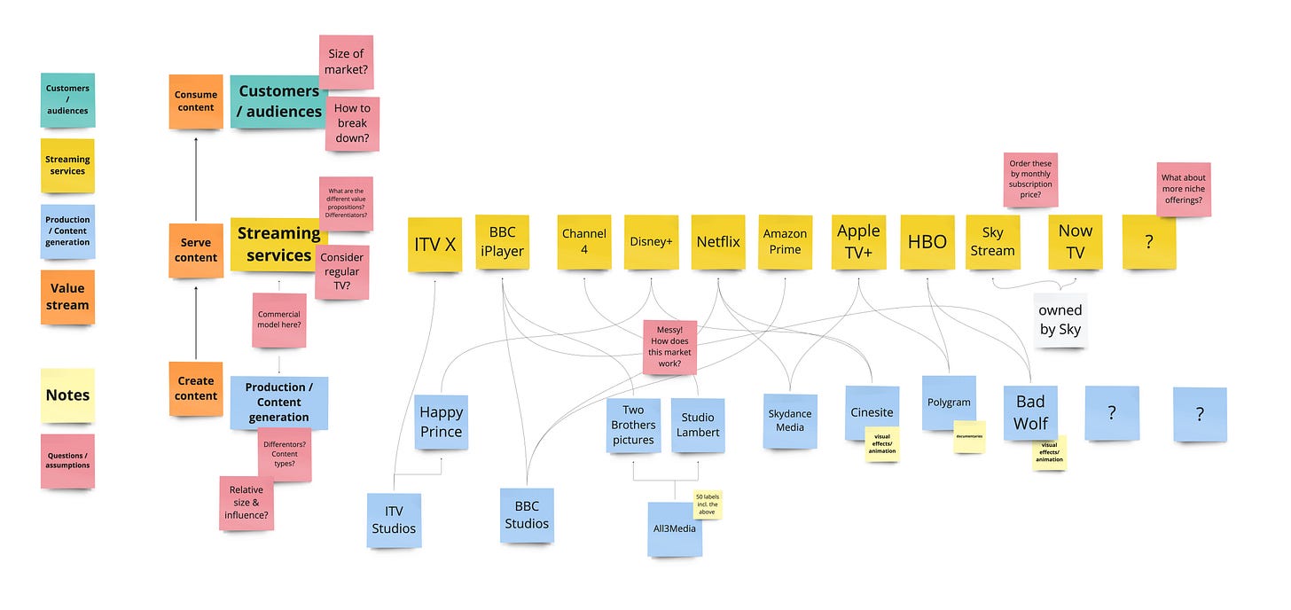
For example, let’s say I’ve just started a new project or job with a streaming service. I watch a lot of TV, but I don’t know much more about how the industry works. I generally start by writing what I know (not much) – who are the major players?
OK I’ve got some but probably missed some, and I also want to think about the value chain: someone needs to create content for them to stream, and there’s obviously consumers at the other end. Let's do a bit more research and mapping...
Now I might start drawing some connections, and as I learn more I start to have a few more questions...
And within about 10 minutes I’ve got a lot more of an idea what the industry looks like and a load of questions to go away and think about.
Next I would probably go any try to answer some of my key questions, and also to sense check with a subject-matter expert or another teammate where possible, iterating on my map over time as I continue to build my knowledge. I might play with adding extra information like market share, subscription price or USP to see what patterns appear.
Don’t worry about your map being tidy, ‘complete’ or perfectly right before sharing with someone: the purpose of this map is to grow your understanding, and often the most useful conversations are around those areas of uncertainly and mis-assumptions.
In addition to being useful for myself, I’ve found these maps to be incredibly useful as onboarding resources for new team members (regardless of how imperfect or untidy they are!).
Mapping organisations
Another area of complexity I come across regularly are the organisations I’ve worked in themselves. Big organisations particularly can be overwhelming, so many teams, products and systems, and sometimes even long-standing employees struggle to see how it all fits together to deliver value. If you’re lucky, your organisation might have a great visualisation of this already – but in my experience this is actually quite rare (and an org chart is not the same thing!).
Again, I find this type of map starts off being for me to get to grips with something, but often ends up as a useful discussion/communication tool much more widely.
The questions I’m trying to answer with org maps are generally: what value do we deliver as a business and how do we do it? How do different teams contribute to that?
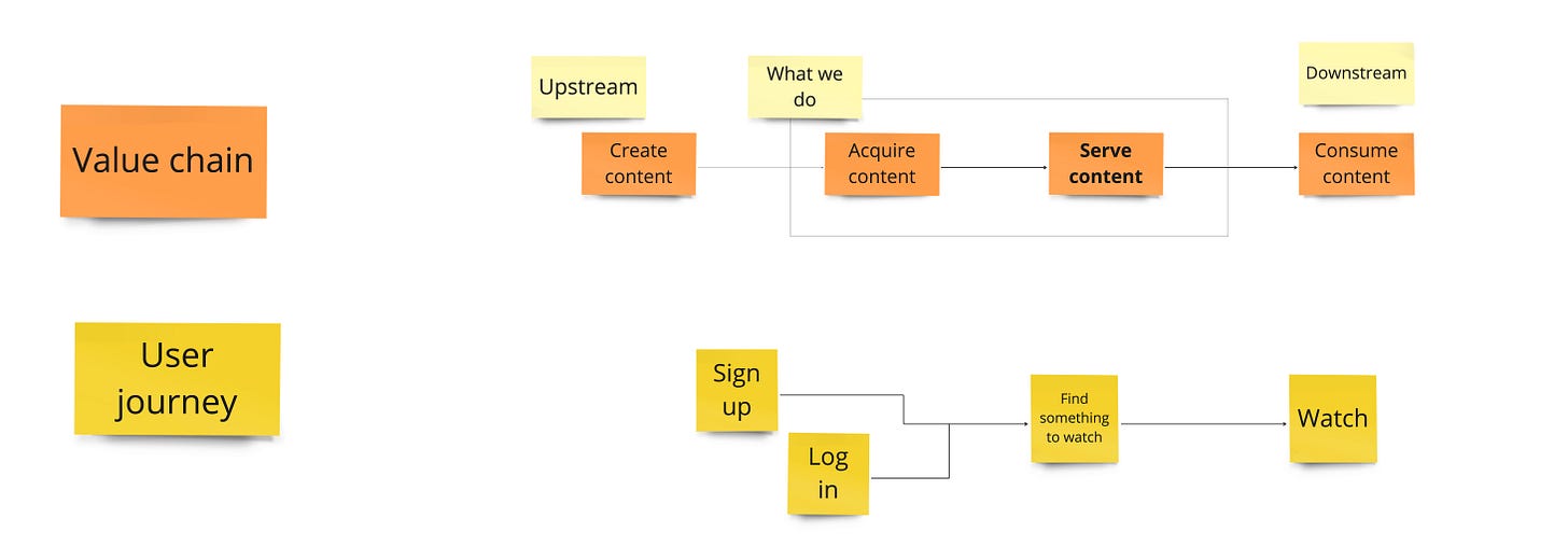
Let’s get started. Using my theoretical streaming service organisation I might start by mapping out the high level steps I already have for the value chain (getting content to users) and what this looks like from a user perspective.
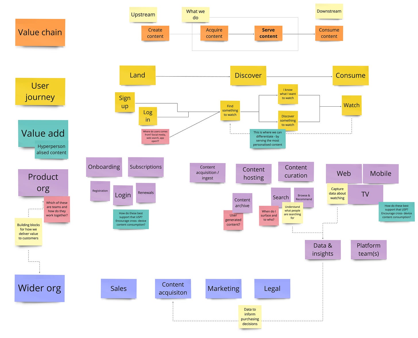
So far, so simple. It’s probably a bit more complex than that, so I add a little more detail to the journey and start to think about where in this process are our key points of value-add.
Next I would start to add the building blocks we have as an organisation which contribute to delivering this value to users. These might be teams, or business functions, I don’t worry too much about getting it perfect at this point I just give it my best guess. That way, when I take it to someone to help me validate – they can point at a bit of my map specifically and say “that isn’t how that works” (rather than a vague conversation about what a team does that leaves me more confused than when I started).
It’s taken less than half an hour to get to this point, and now again I would probably go and try to get some validation on whether this is right/what’s missing, and start to try and answer some of the questions it has generated.
I’ll continue to iterate over the coming days/weeks/even months – depending on what I need (either for my own understanding or for conversations with others) over time it might become more focussed on the user journey, or the value chain, or the teams and their interactions.
Mapping outcomes, metrics & hypotheses
I’m not going to try and regurgitate or distil all the wisdom of the wonderful John Cutler around mapping metrics etc. (see here for one of my favourite articles of his) – but I’ll briefly show how I use some of that great stuff to build further on these maps.
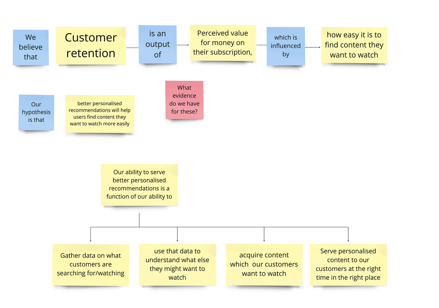
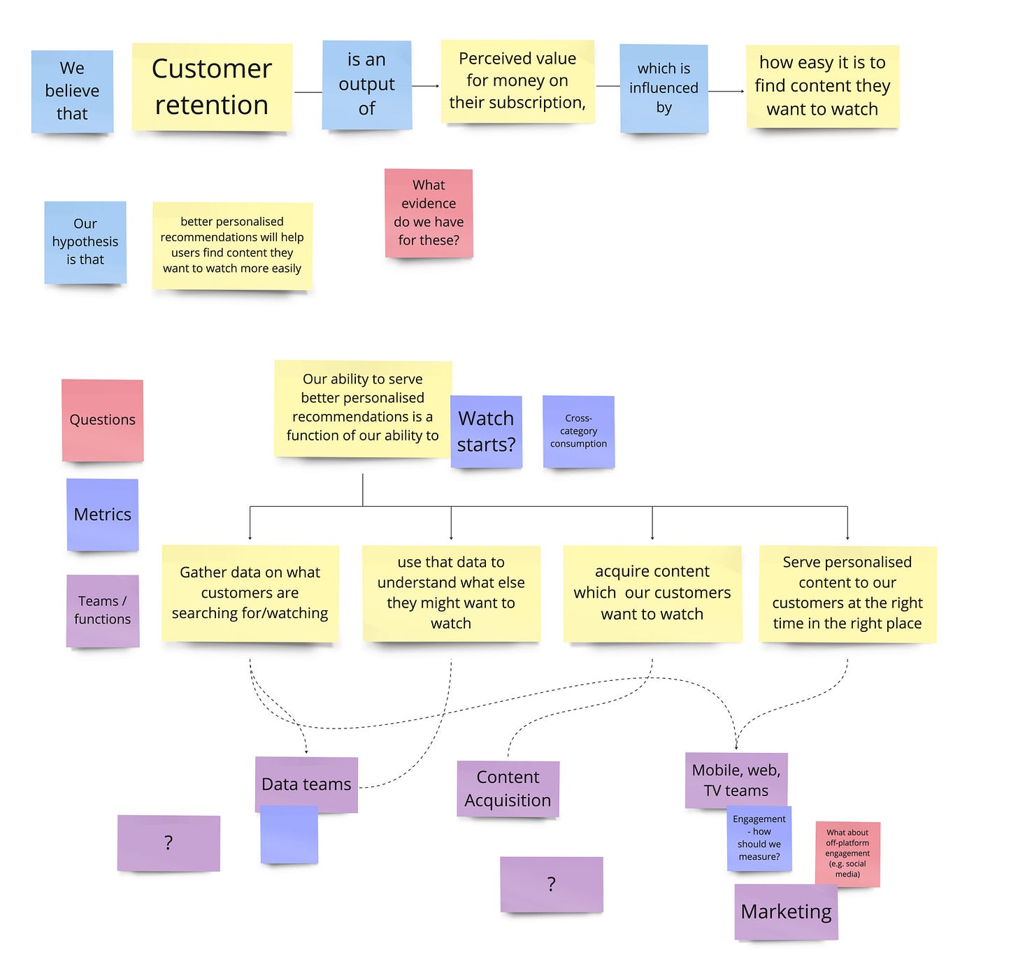
You might have guessed already, but I am a first-principles kind of person - I always want to understand things from the ground up. Suppose I’ve learned our subscription service’s main goal is to increase retention. And say personalised recommendations are a key initiative. I would begin by trying to map out what I think are the hypotheses we’re making here and how we might go about measuring them. After about 10-15 minutes I can probably get to something like this...
It’s not perfect, and it’s based on a ton of assumptions but immediately I can easily articulate (to myself and others) what those assumptions are – and to start to find out whether we have any evidence to validate them or not.
A next step might be to add in key metrics that we track (or should track), and how these might relate to teams (see below). I find doing this exercise myself and then comparing to company and team goals/KPIs etc. can be incredibly enlightening – as they frequently don’t match up as closely as you’d expect. Having done this mapping exercise first allows you to be able to question and challenge from an informed perspective and, in my experience, leads to some really productive conversations.
Mapping tips
A few useful tips from my experience:
Remember - maps are models – they don’t have to be perfect to be useful.
Start small and iterate. You don’t need to have a plan for the whole map, just get started somewhere, and as you discover something new, work out if and how it affects the rest of your map.
Share early and often. Even if your map isn’t going to be a tool for communication and alignment, talking it through with others can spark further questions, draw out assumptions and help you clarify your understanding.
Use a flexible tool for your map. Pen on paper is great for early thoughts but can get painful to keep updating. Post-its on a wall or (my personal preference) in a whiteboarding tool are much easier to edit and move around as your understanding grows
I hope that this article has encouraged you to start making some of your own ‘informal’ maps, and that you find this as useful a tool as I do for navigating the complex world of Product.


